The Value of Values
Note: I want to say that the following post is given entirely within the context of representative painting, specifically realistic plein air painting, that is, plein air painting that strives for realistic representation the scene. We are not discussing abstract painting or stylized painting such as tonalism, fauvism, surrealism, expressionism or even impressionism.
Question…
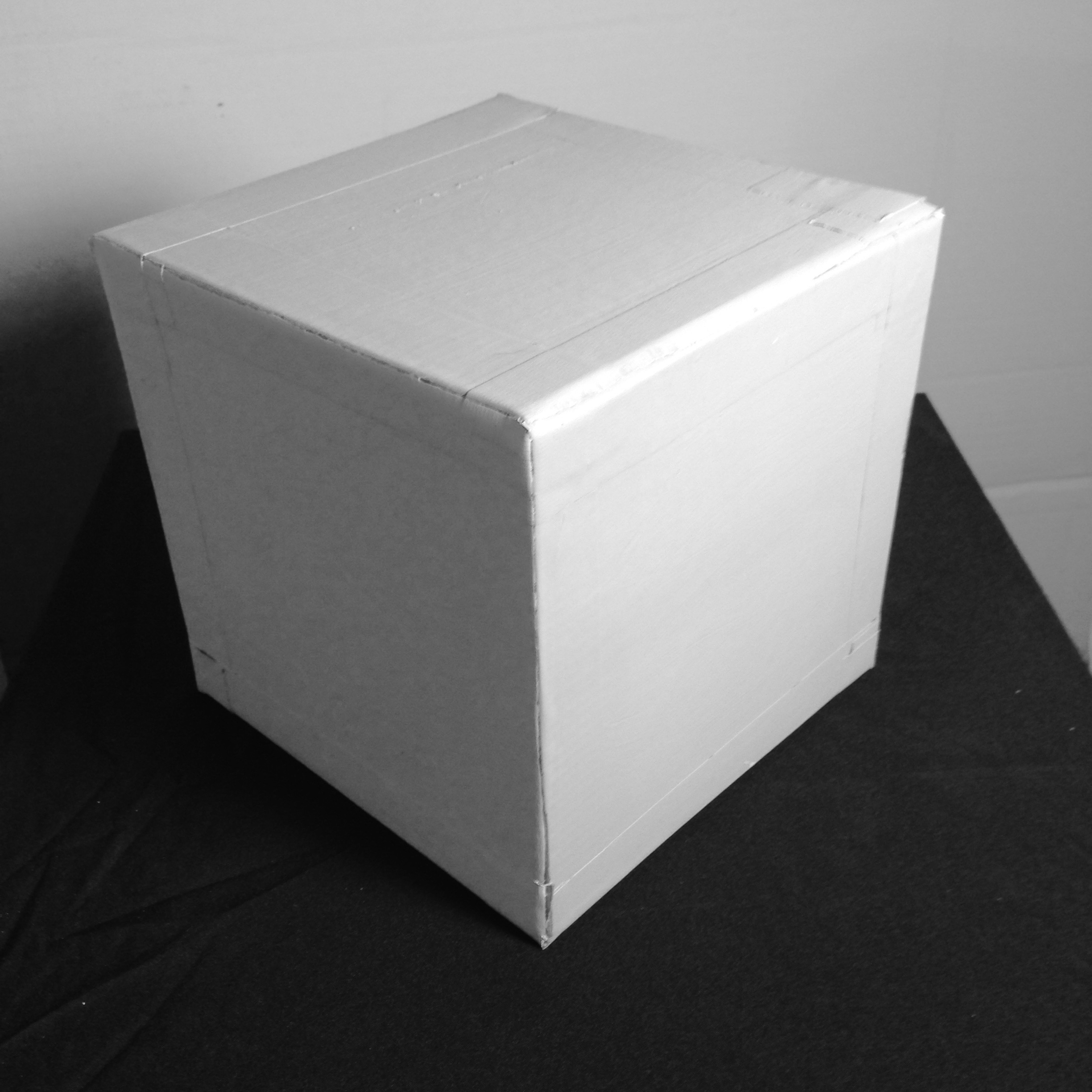
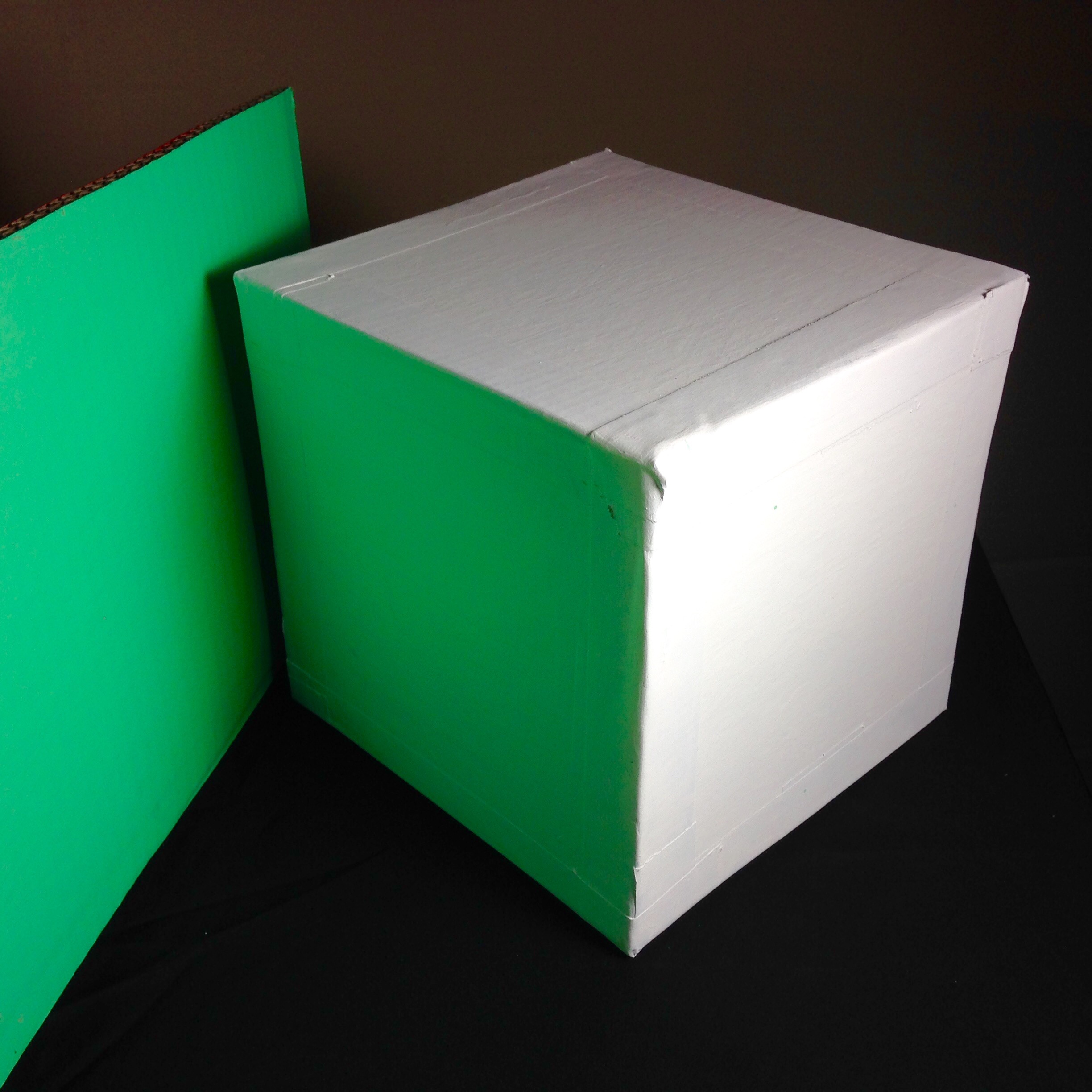
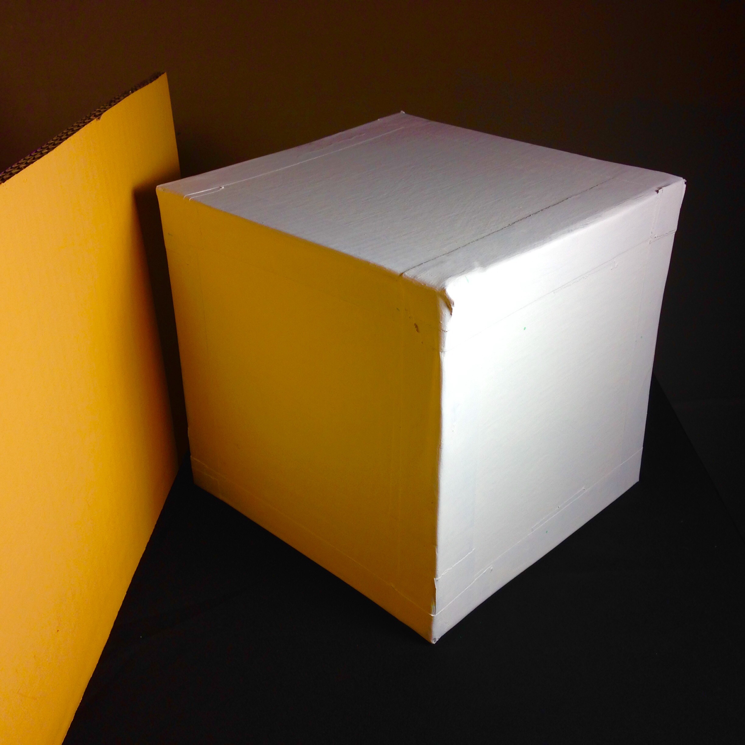
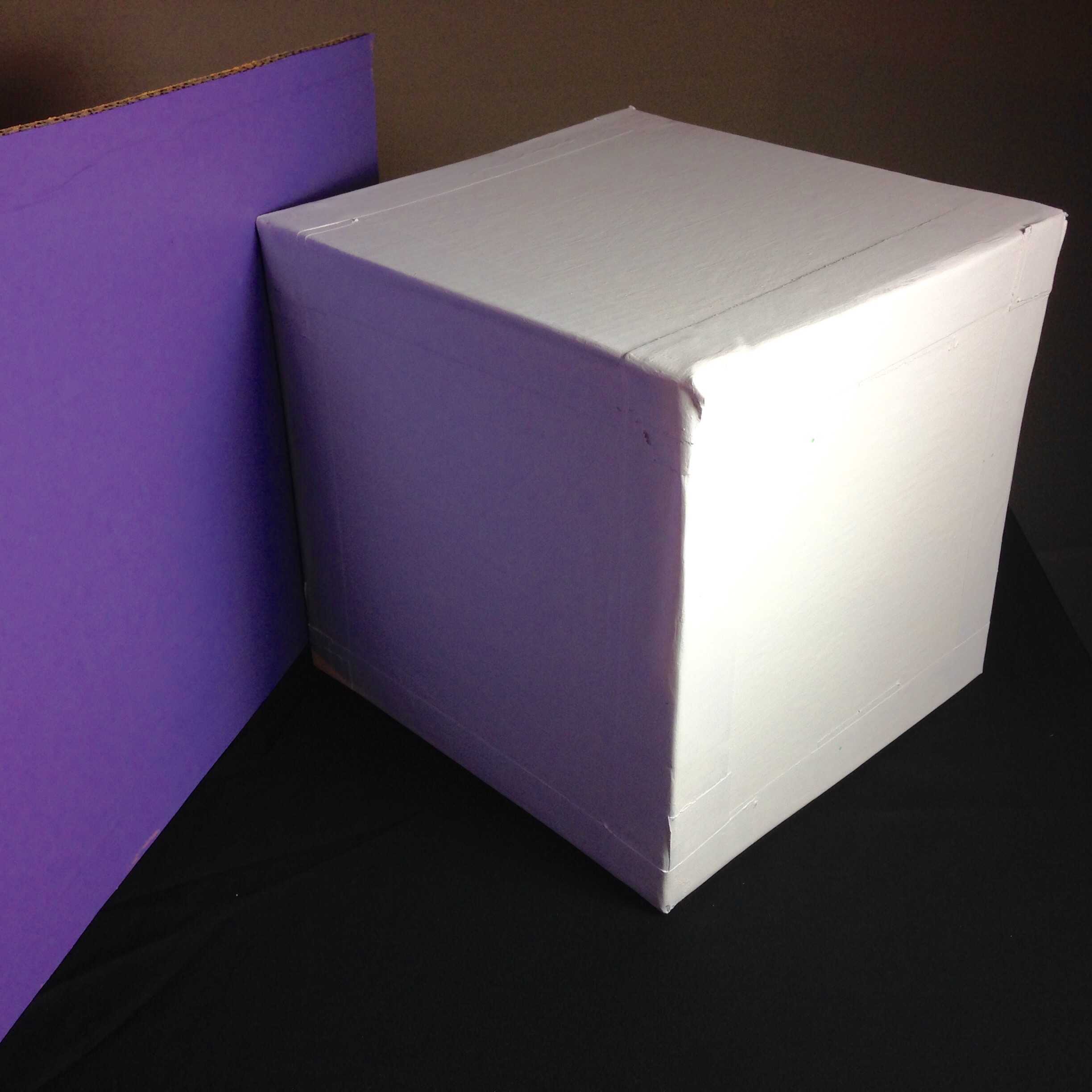
Here is a question for you: What do you think it the color of this cube? Gray? If you said gray, I have to ask you what do you think is the shade of gray? What is the actual shade? What is the shade when it is in the dark corner or when it is out in the open near a window?
The correct answer is: “It doesn’t matter what I think.”
In short, that is the essence of this post and, if you don’t learn anything else, learn that what you think the color is has little or nothing to do with what color it actually is. So, leave your preconceptions behind. You think that is a white building out there, but I am telling you that, if you were to measure the values and the colors, you will find most of the “white” building is actually several colors other than white.
What to Expect from this Post
- You will understand what we mean by values in painting
- You will understand why values are the most important thing in painting
- You will see how your eye can be fooled
- You will learn a method to avoid being fooled
- You will understand how values relate to color
 Definition: What are Values?
Values are the lightness or darkness of a color.
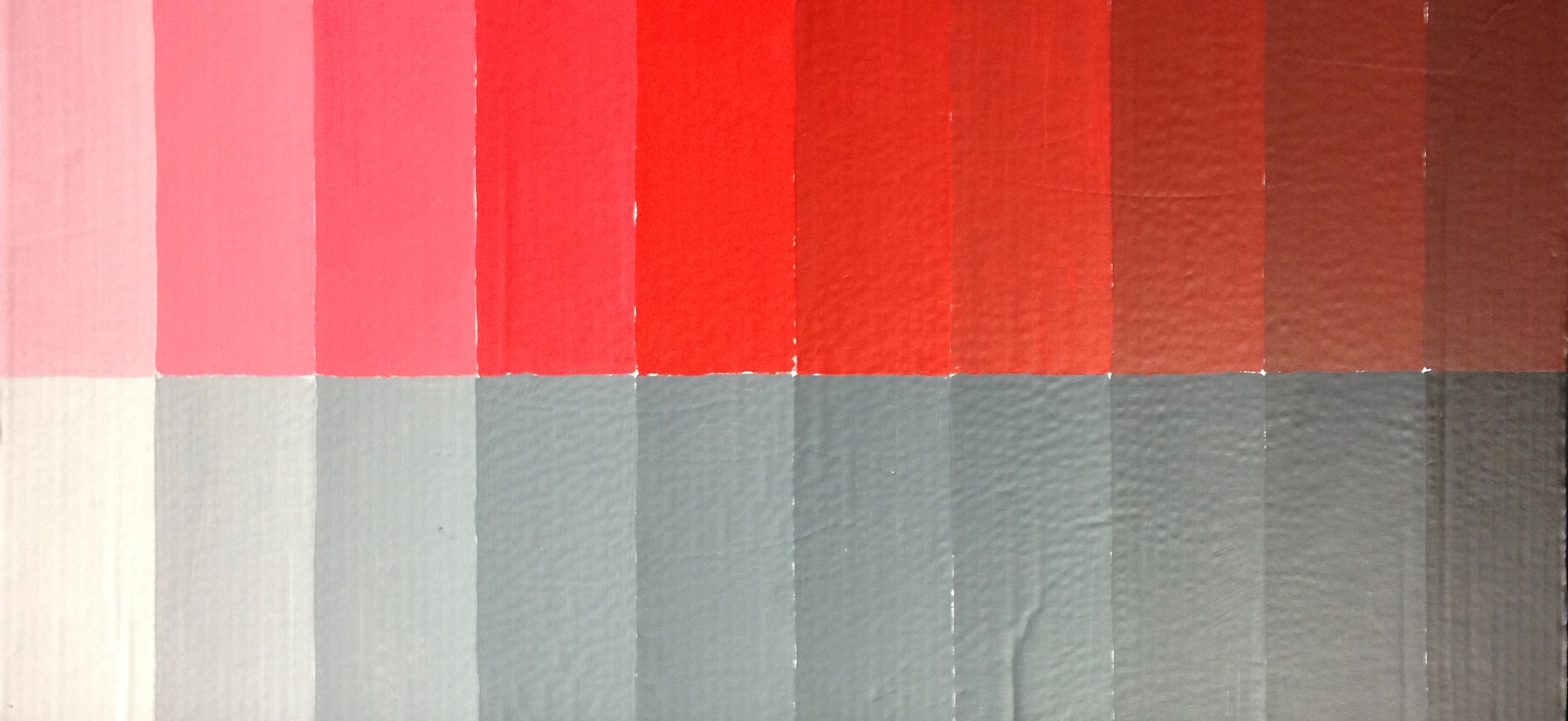
Here is the color red in the middle.
Here is the lightness of the color to the left. The lightness of the color is also called the “tint”. Add white to get the tint.
Here is the darkness of the color to the right. The darkness is called the “shade” of the color. Add black to get the shade.
For now, we will stay with neutral gray.
Values are the Most Important Thing in Painting
(Remember we are speaking within the context of representational painting. Realistic painting.)
Mastery of values is the very first skill a realist artist should master, even before the mastery of color.
Value describes the subject in ways that color can not:
- The volume and the texture of the subject
- The source of light and where it comes from
- Values create the visual structure of the scene through abstract shapes.
How Can I Make this Statement?
How can I claim that values are the most important thing in painting? Isn’t composition and color important? Yes…after values. And I have proof. But to prove it I must first give you…
A Brief History of the Eye
The eye evolved from light-sensitive cells on the skin called photoreceptors. These cells could detect the presence of light or the sudden absence of light which might indicate movement. These cells could not detect color, only the presence or absence of light. These “eyespots” as scientists call them, can not even detect the direction the light is coming from.
The Simple Eyespot
Imagine you are a simple creature. You have no eyes but you have “eyespots”. There you are, crawling about in some remote eon millions of years ago. You know it is day because you sense light. Suddenly, the light is gone! Something has blocked it. It must be something dangerous. You squirm away to safety.
In this scene, we can only perceive two values: light and dark. Light means it is day. Dark means it is either night or it is an object that has blocked the light. Context means everything here. If it is light and suddenly it becomes dark, that means only one thing: dangerous object. If the light fades away gradually, it means one thing: night.
The Concave Eye
A million years later your eyespot has gradually evolved into a concave structure. This accomplishes two things:
- more photoreceptors allowing for more gradations of light and
- the ability to perceive the direction the light is coming from.
You know from which direction the light, or sudden darkness, is coming. You are able to tell which way to run, toward the dark thing that suddenly appeared, or away from it. The concave structure allows for many more photoreceptors.
The Spherical Eye
Even before the eye evolves a lens or even the ability to perceive color, it takes on a spherical shape with a small opening. It has become a sort of pinhole camera. In a pinhole camera there is no lens. The small opening focuses light on the back of the inside of the camera where the film is. The smaller the opening the more focus. A pinhole focuses everything near the camera to infinity. So, if you understand how a pinhole camera works then you see that the spherical eye with a small opening now has the ability to focus the light which allows the perception of many shades or values of light and the recognition of objects.
To Summarize
It is clear that, for survival reasons:
- detection of light comes first
- followed by detection of the the direction of light
- then the ability to distinguish shades of light: values.
Color?
At this early stage of the evolution of the eye, sharp focus and the ability to see color have yet to evolve. Color perception may not have evolved until it was necessary, for example, when food sources like fruits and flowers evolved color.
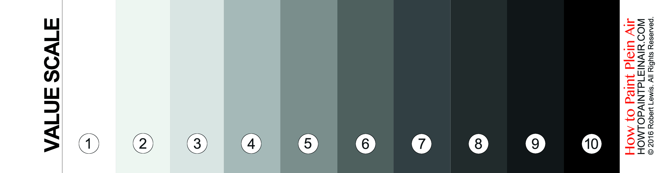
Measuring Values
Here is what is called a Value Scale. It is used to measure values.
There are many versions the value scale, the different versions, 0-9, 1-9, 0-10. 0-9 where 0 is white and 9 is black. 0-9 where 0 is black and 9 is white. Sometimes a scale is 1-10 where 1 is black. This version, where 1 is white and 10 is black, is my own design based on what I feel is most useful because I believe it is a more intuitive design.
Also, in my version of the value scale there is a circular hole in each value (not shown here). This value scale will soon be available on How to Paint Plein Air.
Note: There are other ways to measure value: red filter, squinting, photographing and turning photo to grayscale. All of these are useful. For this discussion, I am going to focus on the use of my value scale with the help of some squinting.
How to Use the Value Scale
Do the following:
- Hold the scale horizontally with the holes to the top
- Hold at a 45 degree angle
- Try to have the scale and the subject in the same light
- Squint
- Move the scale back and forth over an area of your subject until the scale and the area match. For example, hold the scale over the sky and find the value that matches.
- Note the value number
Checking Values: Don’t be fooled!
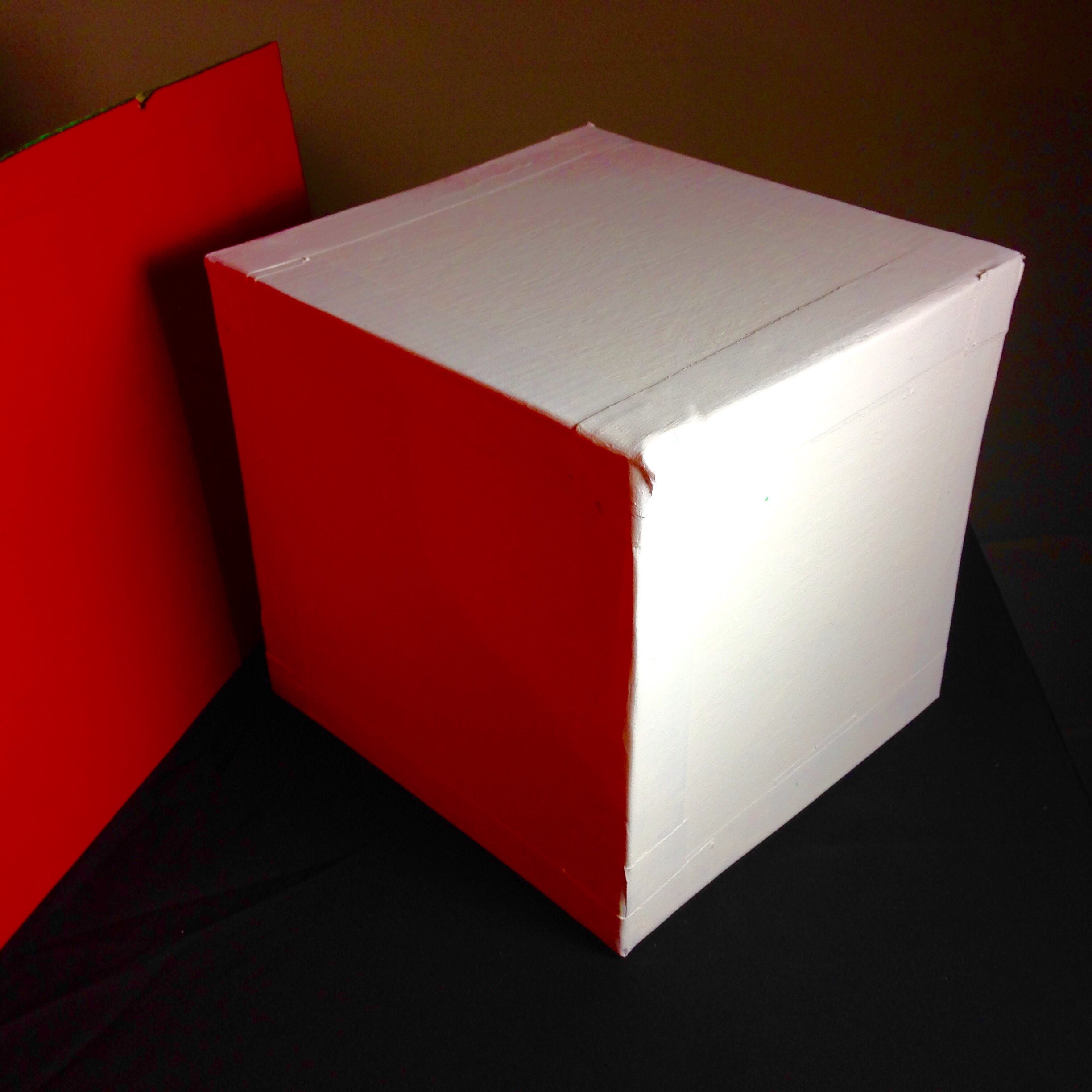
Now we are going to get some experience. Hold the value scale up to the image of the gray cube shown above and measure the value of each of the surfaces. Measure the values of the surface it is sitting on and the wall behind it.
Now look at the graphic below. Which square is lighter, which is darker?

As you may already know, or may have guessed, each gray square is the same color. This shows how the perception of value changes in context. The value has not changed, only your perception of it.
The Actual Color of the Gray Cube
“What do you think is the actual color of the cube?”, was the question. I have to confess that the gray cube is actually a different shade on each of the six sides. This is to prove to you that you can not trust your own eyes if you want to get the values right. Sneaky trick, I know, but worth it.
Relating Value to Color
How does all of this relate to color? Every color has a value that relates to the gray value scale. Here we show red. But it could just as easily be blue, yellow, or any other color.
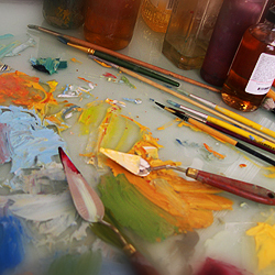
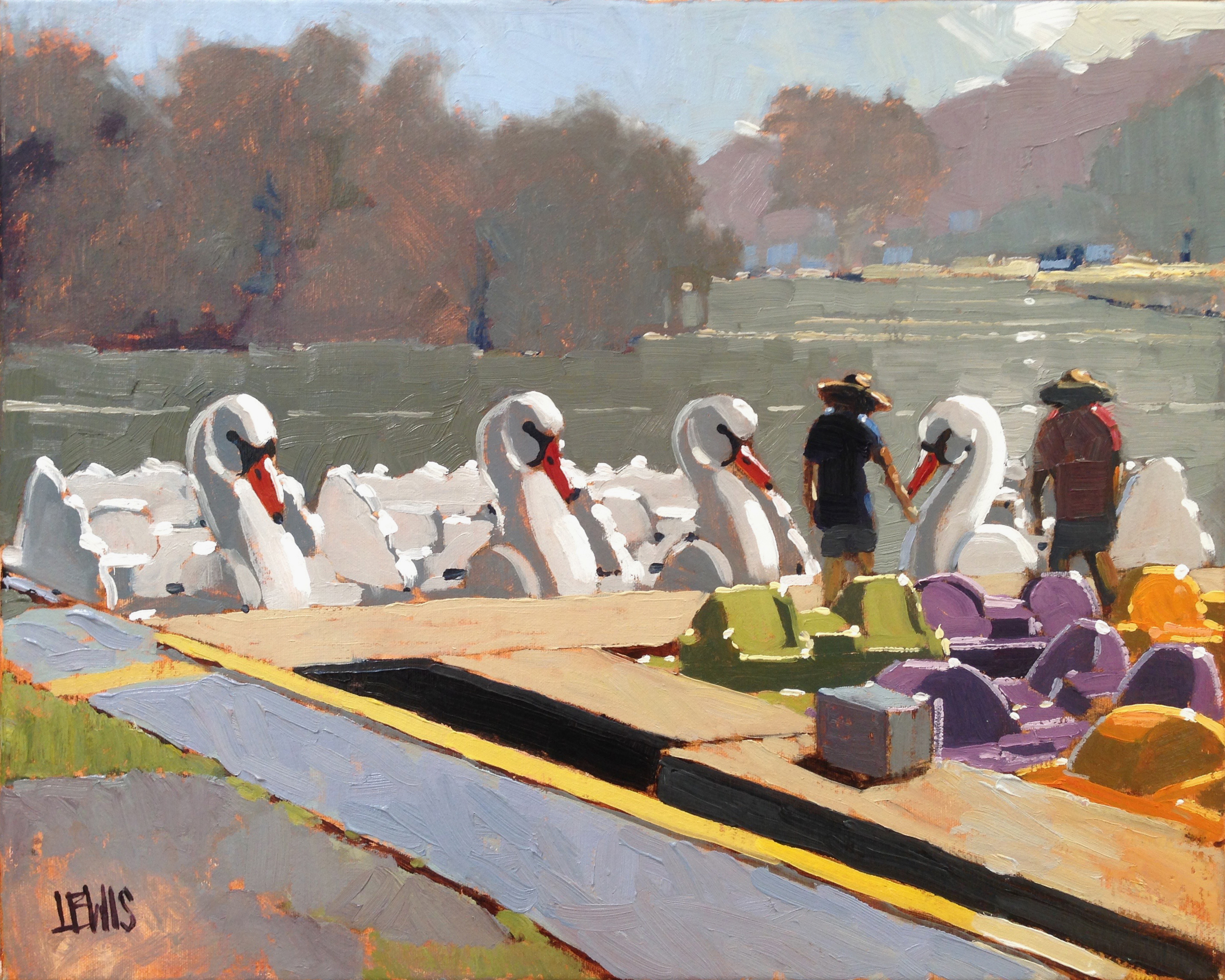
Here is a scene that I recently painted…

Here is the finished painting, “Joaquine, Juan, and the White Swans”, 20″x16″ oil on canvas, painted plein air.
Here is the same painting with the color removed.
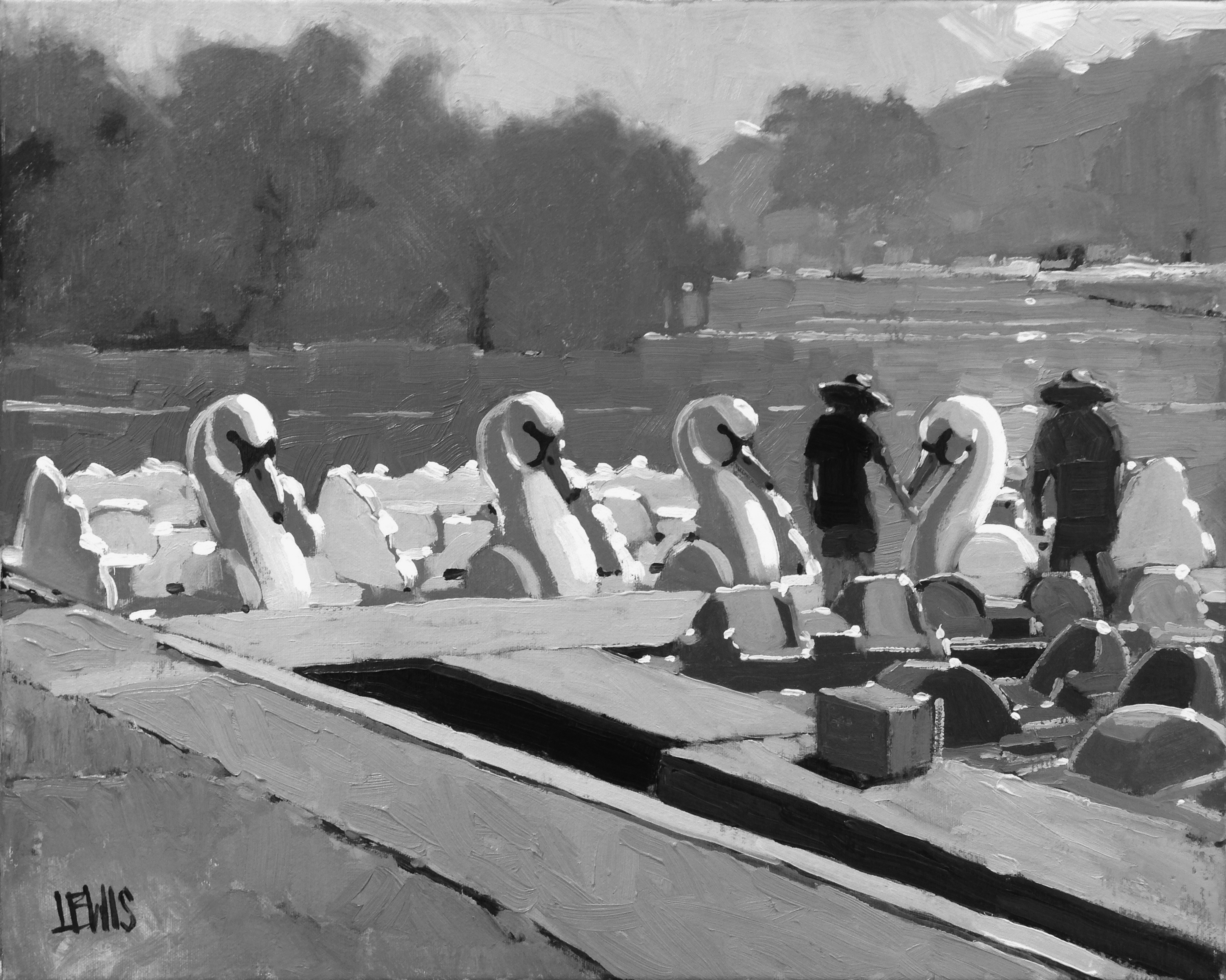
See how the gray scale values are embedded in the color? You do not need the color to understand the subject, you only need the values.
Use your value scale to measure the color in the sky of the full color image. Then see if the value of the sky in the grayscale image is the same. Check the surface of the dock the same way. Check for foreground. Values in each images should match fairly closely.
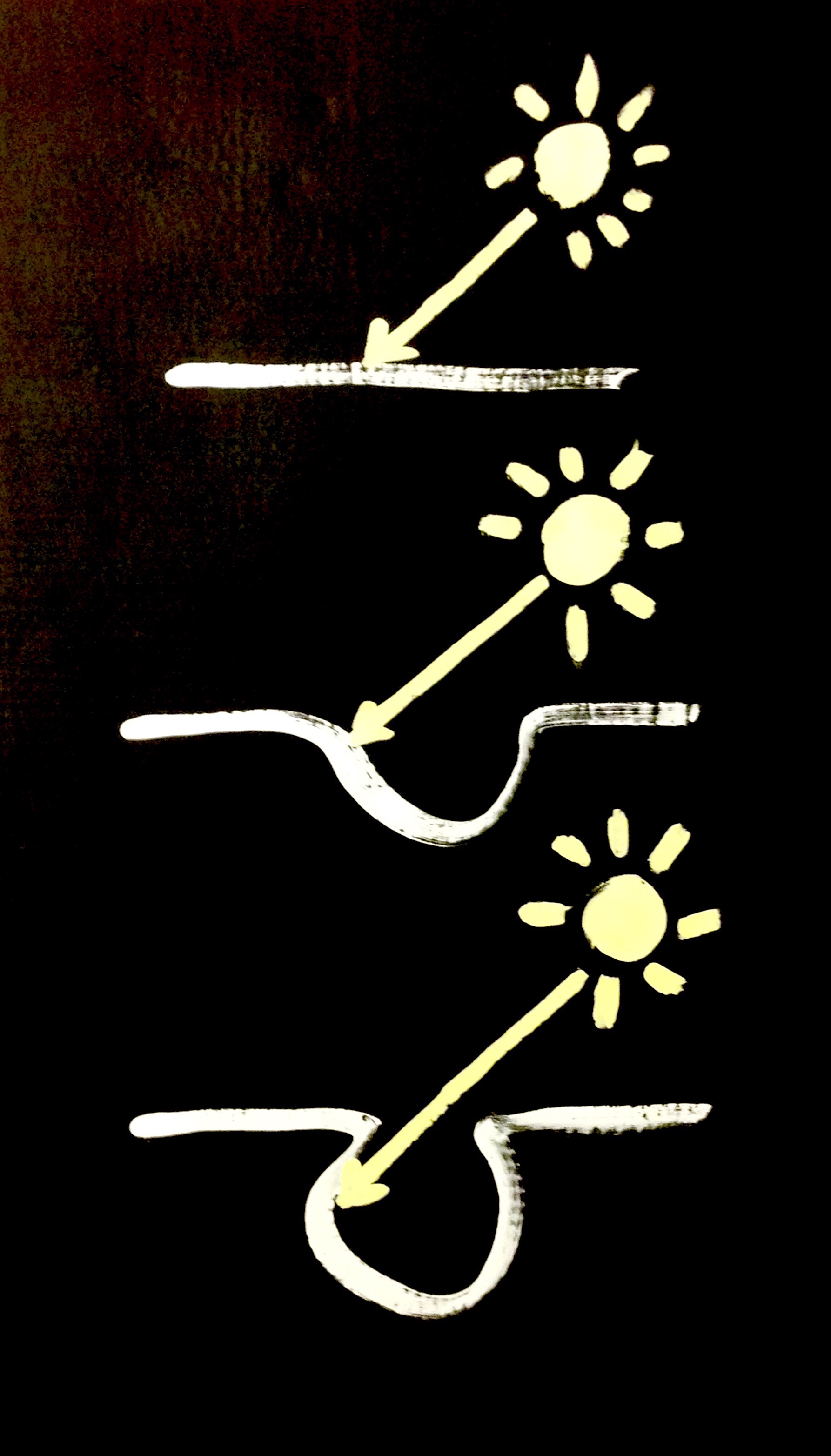
Reflected Color
Remember the white building that is really almost never white? Here is a white cube (or is it) that is almost never white. If just plain values weren’t hard enough to grasp, here is one more thing to make things difficult. To make things even more complicated, you must be prepared to deal with reflected color, especially the color reflected from the sky into your shadow areas.
A Note on Checking Actual Color
Check the actual of a subject by mixing color and holding up a brush containing the color. See if it matches. The disadvantage of this is that the brush texture interferes with the color. Better to use a palette knife. Hold up the mixed color on the palette knife. The best solution is to use a white card or a square of high-density polypropelent (HDPE):
- Mix your best guess of the color
- Smear some evenly on the surface of the color checker right to the edge.
- Making sure that the light falling on the color checker is the same as the light falling on the subject…
- …hold the color checker up so that the mixed color if overlapping the color on the subject.
- Make adjustments to the color until it matches perfectly
Conclusion
Remember these things:
- values are the lightness and darkness of a color
- the importance of values is hardwired into our brains
- values are more important than color
- Learn to use a value scale to find the value of a color
- it doesn’t matter what you think. Measure it.