
3 Eye-Opening Truths About Color Most Artists Don’t Know
The Three Architectures of Light: Beyond the Primitive Wheel

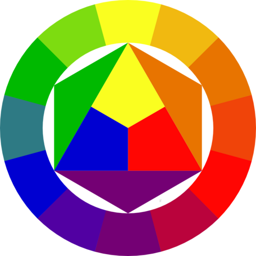
The artist often stands before the easel, mixing with hope but landing in mud. The palette becomes a graveyard of “off” notes. This frustration is not a lack of talent; it is the result of a broken compass. Without a coherent system, the painter is merely guessing at ghosts. As Florent Farges¹ observes, a random sound is noise, but an organized system is music. Most are taught a primitive Red-Yellow-Blue (RYB) wheel—a system that sounds pleasant in a classroom but fails under the north light.
I. The False Map of the Schoolroom
The traditional RYB wheel, championed by Johannes Itten², is a deceptive foundation. It claims to be a deductive model where three primaries birth all others. In practice, the gamut is narrow. The artist cannot find the vibrant pulse of a true purple or the electric snap of a bright green within its limits. It survives only because the world is largely composed of dull tones, which the RYB wheel handles with ease.
More critically, the “complements” taught in this model ignore observational honesty. Staring at a color creates a specific afterimage—a physiological truth. Science and the eye agree: the true visual opposites are Red-Cyan, Green-Magenta, and Blue-Yellow. To ignore this is to struggle fruitlessly with neutralizing tones or creating visual tension. The Itten wheel simply does not work for the one who seeks to paint the truth of light.
II. The Trinity of the Stroke: Hue, Value, and Chroma
To master the medium, the artist must view color as a three-dimensional volume. Most theories dwell only on Hue—the name of the color. This is a shallow pursuit. A painting is built on a trinity:
- Hue: The identity (red, green, blue).
- Value: The lightness or darkness.
- Chroma: The intensity or “vibrancy” of the pigment.
The masters—Sargent³, Van Gogh⁴, or Bato Dugarzhapov⁵—understood that Value is the weight of the work. It defines form and carves volume out of the flat canvas. A theory that ignores Value is a theory that cannot describe a human face or a rolling hill. It is a map without topography.
III. The Hierarchy of Composition
The novice begins with Hue, choosing colors like a child with a box of crayons. The master works in reverse. A powerful composition is a skeletal structure of Value and Chroma before a single Hue is finalized.
- Value First: This is the stone foundation. A painting must succeed in black and white. One decides the arrangement of shadow and glare—whether the light is the harsh sun of a Russian landscape or the soft candle of a Dutch interior.
- Chroma as the Guide: High chroma is a shout; low chroma is a whisper. If every inch of the canvas screams with intensity, the viewer hears only noise. One uses a sea of muted, low-chroma tones to make a single high-chroma accent sing. This is how the eye is led.
- Hue as the Ornament: Consider Hue the “icing on the cake.” If the value structure is sound and the chroma is disciplined, any elegant hue will sit comfortably. The heavy lifting is already done by the light and the gray.

Moving beyond the schoolroom wheel requires embracing the three-dimensional reality of light. When the guessing game ends, the painting begins.
The eye observes the truth; the hand merely follows the light.
Notes and References
¹ Florent Farges: Contemporary realist painter and educator
² Johannes Itten: Swiss expressionist painter and Bauhaus theorist
³ John Singer Sargent: Expatriate American painter and master of bravura brushwork
⁴ Vincent van Gogh: Dutch Post-Impressionist painter known for bold colors and emotive brushwork
⁵ Bato Dugarzhapov: Contemporary Russian Impressionist known for light and atmosphere