Color Lab: Creating a Zorn Palette Grid
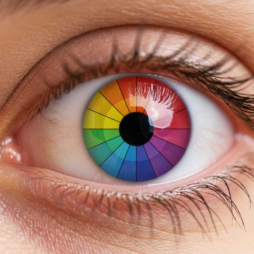
To truly understand how a limited palette works, you should build your own color chart. This “color lab” exercise trains the eye to see how black, red, yellow, and white interact. Together, these colors create a full range of atmospheric tones.
1. Preparation
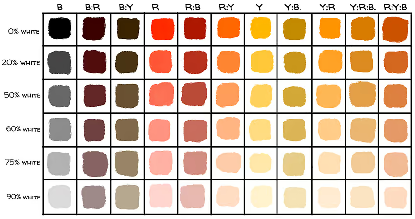
Use a canvas or a sturdy panel. Draw a grid with eight columns and six rows. Label your columns as follows:
- B (Black)
- R (Red)
- Y (Yellow)
- B:R (Black and Red)
- B:Y (Black and Yellow)
- R:Y (Red and Yellow)
- B:R:Y (A three-way mixture)
2. Establishing the Mass Tone
Fill the top row (0% White) with the pure colors or mixtures straight from the tube. This row represents your most saturated “mass tones.”
3. Mastering the Value Scale
In the rows below, gradually add more white to each mixture. Aim for consistent steps:
- Row 2: 10% White
- Row 3: 30% White
- Row 4: 50% White
- Row 5: 70% White
- Row 6: 90% White
4. Identifying the “Contextual Blue”
Pay close attention to the B (Black) column. As you add white, you will see a neutral gray emerge. Once your entire chart is finished, look at how that gray appears compared to the R:Y (Orange) mixtures. The gray will shift toward a blue-violet hue.
5. Defining Flesh Tones
Examine the R:Y and B:R:Y columns. These are the “plain-spoken” notes you will use for portraits. The three-way mix (B:R:Y) will create the earthy, muted tones found in shadows and transitions on the skin.
The light is the only true teacher.